
About This File
MLB 2K12 UNIFORM TEMPLATES MAJOR REWORK BY UMACHINES
Hello, guys. It's been a long time since I'm not really active at these forums. Please, remember English is not my mother tonge, so sorry if I don't explain myself clearly, or for any misspelling.
Ok, that said, I wanted to post this here cause I'm finally helping MVP Caribe crew in a 2K12 mod, and you know uniforms is what I really like to do. So I dusted my files off and I thought about starting to make some uniforms to warm up. But I noticed MLB 2K uniforms have changed very few since 2K9, the time when I made my MLB caps mod. In fact, some few things, like caps themselves, now even use less resolution bitmaps (shame). But the main templates remain almost the same thing, for worse. Although this game's engine is much modern and powerful than MVP's, there are several things I've never liked about these uniforms, mainly the way jerseys are designed. And I'm sure several people here share at least part of what I'm complaning about.
But I hope it is not too late to introduce some changes myself, before really starting to make uniforms. So, this is what I've seen about MLB 2K12 unies and what I did to try to fix these issues:
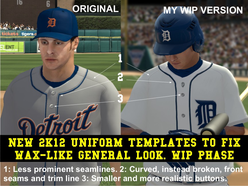
1) First of all, they still look like made of wax. Since 2K9, not just me, but many users have notieced it. Seam lines are too thick and visible from a relatively far point of view. I'm triyng to make a lighter version of the seamlines, including smaller seam dots, or even removing them from parts where they actually can't be seen in the real stuff.
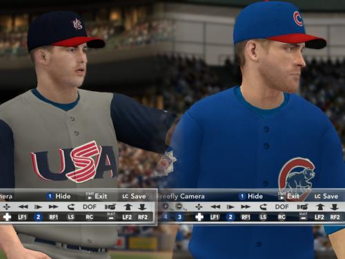
2) The buttonfront seams, and trim line when there is one, have this break point like a corner, very different from the real uniforms. In real Majestic jerseys, these lines have a "Y" like shape, with a very soft curve instead. See one of the pictures if I don't explain myself correctly. For my review, I spent a while drawing a more accurate shape for these lines, testing, drawing again, and I think at last I got it.
3) I really hate the default jersey buttons. They look like pig noses to me. I Dont know what the designer was thinking about when he made them. Even worse, they are exactly the same jersey color, what makes them look like made of wax or clay too. What I did was replacing them for a smaller version, with a color a bit darker than the one used on the jersey.
4) I also included a fix for the pant waistband to look more like Majestic current MLB model. It maight be a very minor detail, but I wanted to fix as may things as possible.
To show you my WIP at fixing these problems, I'm bringing you four uniforms that you can easily intall in the game in order to test them. These are the uniforms:
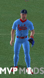
a- Detroit Tigers White Uniform: Everything began with this uniform because it's very simple and easy to work with it, in order to start a new project. It features the front trim that moved me to start making some changes. I spent several hours working on it, testing and trying different things, in order to achieve what I did with it and the other ones.
b- WBC USA Dark Gray Uniform: Designed to work in Atlanta Braves main visitor slot. I made this one to test dark gray and vest style in the same piece. I Particularly like this piece cause I think it's the only dark uniform of the WBC17 that looks good.
c- Arizona Diamonbacks main Local Uniform. A challenging one. I guess making a difficult uniform would be a good idea to show you these templates potential.
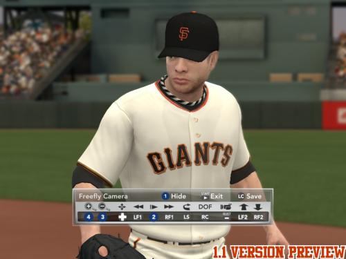
d- San Francisco Giants Home Uniform. This is my favourite uniform of any baseball team. I'm not exactly a Giants fan, but I think this uniform is just great. But at the same time, achieving its true color can be very painful. Most versions of this uniform in any game are very far from the way it really looks. It is not really cream. Its color is something between white, and yellowish, depending on the enviromental light. They call it 'eggshell'. So I thought it would be a good idea to make it my way too. Hope Giants fans share my point of view.
My final goal with this project is making not only uniforms, but releasing a set of templates and tools that will help anybody who wants to add these changes to his own pieces. Right now, I dont have the time, or the age, or the strenght anymore to begin a major uniform rework project. So what I really want is leaving it to the ones who are willing to make their own improved versions of the game uniforms.
I hope you like them. And expect some news about this project in the next days.
EDIT: And please leave some feedback and feel free to show me any detail I'm missing, or anything else that I could fix on these uniforms.
Vladimir Altuve, AKA Umachines, MAR 30, 2017.
What's New in Version 1.2 See changelog
Released
NOW YOU CAN DOWNLOAD MY ADOBE PHOTSHOP TEMPLATES FOR YOUR OWN PROJECTS.
-First version of the public Photoshop templates. See details in the PDF file. Added two Chicago Cubs Uniforms for the preview: Blue jersey with gray pants and a Fantasy uniform, only to show some features.
-Preview uniforms and templates are separated in different files, in case you are not planing to make any uniform, and just want to have a look at the progress.
V1.1 ARE STILL THE SAME TEMPLATES
The real update is three new uniforms to show some progress on special dark jersey templates WIP:
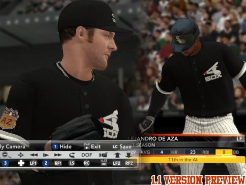
-Chicago White Sox Black BP
-Cleveland Indians Navy Blue jersey away
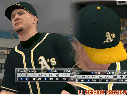
-Oakland Athletics Dark Green Jersey away. I've added a txt file to fix front numbers with Roster Editor.
Special Dark Jersey Template is an attempt to fix some problems with dark uniforms and my regular colored jersey template. Seamlines are darker, buttons are lighter and there is a stronger fabric effect. Please, Pay attention to this fabric effect, using replay zoom tool. And don't hesitate to leave some feedback if you like it, or if you don't, cause it can happen and opinions are very important to me.
Also all original uniforms have some front button and cut line updates. There is a special work on Giants eggshell uniform lettering alignment. And pay attention to the caps, since I'm testing my own versions too, thinking about adding a cap template later. Duoble trim is also thinner, and it will be updated on templates next version.
THINGS ADDED IN V 1.2
TEMPLATES HAVE BEEN UPDATED THIS TIME
The front button cut line effect has been reinforced. There are some more important changes:
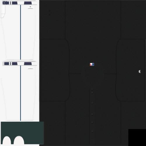
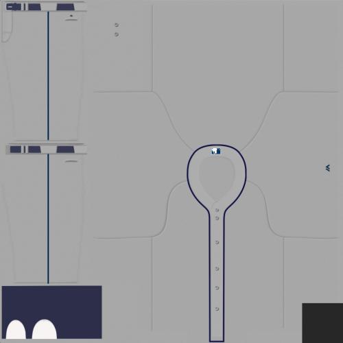
1)- In the white and gray template, almost at the bottom of the file, hidden, there are three objects: NeckTrimColor1, NeckTrimColor2 and NeckTrimColor3. Use them to make your neck trim lines. Move them to a top layer and you can paint them the color you want. I used them for Indians silver neck trim and the triple line trim of San Francisco eggshell uniform. Rememeber you can move these elements to the other templates too.
2)- Double Trim Lines in Colored Jersey templates are a bit thinner than in the original version.
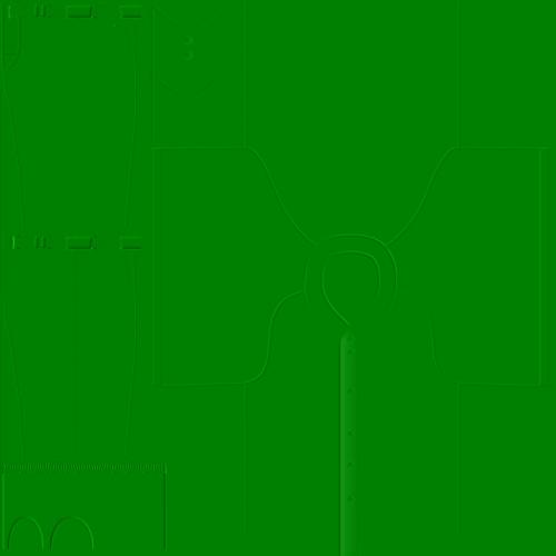
3)- I’ve added a special template for darker uniforms. Special Dark Jersey Template is an attempt to fix some problems with dark uniforms and my regular colored jersey template. Seamlines are darker, buttons are lighter and there is a stronger fabric effect. Please, pay attention to this fabric effect, using replay zoom tool. And don't hesitate to leave some feedback if you like it, or if you don't, cause it can happen and opinions are very important to me. There are FOUR dark tested colors in this template. Just remember to turn on only the jersey color you want to work with.
4)- Now there is also a Template for the caps. In cap template there are three files. “UMCapTemplate.psd”, that’s the template itself. It works very similar to the uniforms template, but you just have to produce the main picture. Most of the elements can be painted, like the main background, cap visor, top button, etc. The other two files are UMCapMain.dds and UMCapgreen.dds. You need to replace UMCapMain.dds picture for the one you will produce. Alpha channel is a white blank layer. The green texture is my own version with very different seam style. Dont forget to apply this green texture to the uniform, since the magic is here. I’ve modified one of the DDS textures of my 2K9 cap mod, and I guess the results are very good. The only missing thing here are the cap logo files, but that's another story by now.